
The Pieces

I have chosen 8 of my works to represent my creative ability for design and imagery.

Title: United Hebrew Center Emblem
Medium: Digital Vector Art
Style: Contemporary Symbolic Emblem with Regional Influence
Description:
This emblem for the United Hebrew Center (UHC), established in 1950, harmoniously blends Jewish identity with a bold, regional aesthetic. At the center stands a vivid blue Star of David, its geometric precision symbolizing unity, resilience, and tradition. Nestled within the star are the iconic Tablets of the Law, inscribed with Hebrew letters, anchoring the design in the sacred teachings of the Torah.
The backdrop features a semicircular gradient composed of horizontal color bands—burgundy, purple, navy, and green—that subtly reference the diverse landscapes surrounding Pueblo, Colorado, from the sandstone mesas to the fertile valleys. The curvature of the backdrop, capped with the text “United Hebrew Center,” evokes a rising sun, suggesting renewal, continuity, and the enduring presence of the community.
The establishment year, Est. 1950, grounds the logo in its historical roots, rendered in a bold burgundy tone that echoes the background hues. The overall design fuses spiritual heritage with a modern visual language, creating a warm, accessible, and regionally conscious identity for the congregation.

Title: 2026 Kids’ College Promotional Flyer
Medium: Digital Graphic Design
Style: Playful Educational Advertisement
Description:
This vibrant and engaging flyer for the 2026 Kids’ College at Pueblo Corporate College captures the spirit of youthful curiosity and academic excitement. Bold, colorful typography spells out “KIDS’ COLLEGE,” with each letter playfully rendered in crayon hues of green, red, yellow, and blue, evoking a classroom feel and a child’s creative hand. Surrounding the title, oversized crayon illustrations further emphasize the playful theme, adding visual energy to the design.
The central image of an old-school green monochrome computer screen reads, “INTERESTING AND EXCITING CLASSES,” drawing a nostalgic connection between early technology and modern learning. A friendly cartoon mascot, a wide-eyed gray baby panther in a maroon graduation cap, smiles invitingly from the lower right, giving the flyer a warm and approachable personality.
Paw prints scattered throughout the flyer guide the eye from section to section, while bold black lettering clearly lists program dates by grade groups, making the essential information easy to find at a glance. The design is punctuated by Pueblo Corporate College’s logo and a clear accessibility statement, ensuring inclusivity and professionalism within the flyer’s playful context. This piece successfully balances youthful appeal with informative clarity, perfectly suited to attract both students and parents

Title: Star Trek: It Is Time to Discover the Final Frontier
Medium: Digital Poster Art -Adobe Photoshop
Style: Retro-Futuristic Sci-Fi Advertisement
Description:
This dynamic Star Trek poster channels the vibrant, adventurous energy of 1960s and 1970s sci-fi promotional art. Set against the infinite black canvas of space, speckled with delicate white and pink stars, the poster boldly declares its message in bright, retro-styled red and yellow text: STAR TREK: IT IS TIME TO DISCOVER THE FINAL FRONTIER. The typography’s vintage curvature and high contrast perfectly echo the original Star Trek branding and classic sci-fi movie posters.
Dominating the foreground is the sharp, resolute visage of Mr. Spock, rendered in a painterly, hyper-realistic style that captures his iconic stoicism and intellectual intensity. Beside him stands an enigmatic alien figure clad in a shimmering, futuristic silver uniform, its exaggerated cranial features and cold, analytical gaze evoking the spirit of the unknown and the mysterious “other” often explored in Star Trek narratives.
The overall piece is a love letter to vintage science fiction—blending nostalgia, adventure, and curiosity—urging viewers to embrace the timeless mission of exploration beyond the final frontier.
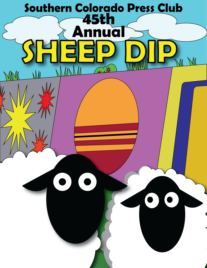
Title: Southern Colorado Press Club 45th Annual Sheep Dip
Medium: Digital Graphic Poster
Style: Playful Pop Art with Cartoon Elements
Description:
This cheerful and quirky poster celebrates the 45th Annual Sheep Dip event hosted by the Southern Colorado Press Club, using bold, cartoonish visuals and a bright, engaging color palette. The playful scene is anchored by two wide-eyed sheep with stark black faces and fluffy white bodies, their exaggerated expressions drawing immediate attention and setting a humorous, lighthearted tone.
Behind the sheep, a whimsical landscape unfolds—a dynamic patchwork of abstract shapes, bold stripes, and comic-book style explosion bursts in primary colors. The composition’s energy is further amplified by the slanted, asymmetrical panel arrangement of the Mural wall of the Arkansas river, lending the scene a sense of fun chaos and spontaneous festivity. The Mural wall, emblazoned with a stylized sunset anchors the backdrop while playful green tufts of grass and puffy white clouds add layers of visual interest.
The event title SHEEP DIP pops in bold, bright yellow, outlined in black to ensure high contrast and visibility, while the playful typeface complements the cartoon aesthetic. The overall poster is a lively, tongue-in-cheek visual that perfectly captures the humor and communal spirit of this long-standing Southern Colorado tradition.
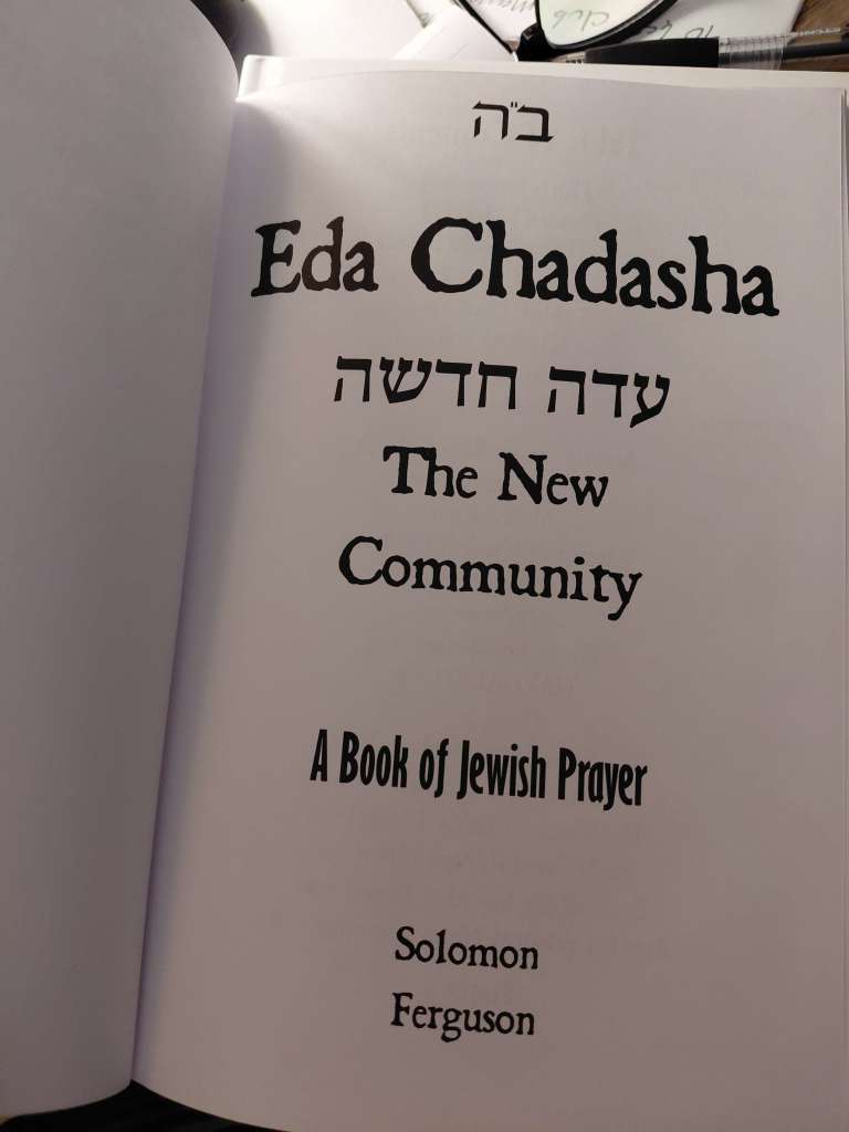
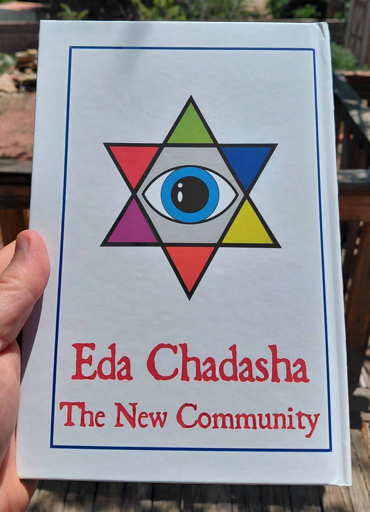

Title: Eda Chadasha: The New Community
Author: Solomon Ferguson
Medium: Printed Book (Hardcover)
Style: Contemporary Liturgical Design with Modern Jewish Identity Elements
Description:
Eda Chadasha: The New Community is a modern Jewish prayer book that merges traditional liturgical frameworks with a contemporary, inclusive vision. The title, elegantly rendered in both Hebrew and English on the interior title page, sets the tone for a work that is at once grounded in heritage and forward-looking in its communal approach.
The Front cover begins this visual narrative with a minimalist yet profound arrangement of colored circles forming a symbolic pattern. This design alludes to the sefirot of Kabbalistic tradition, suggesting layers of mystical meaning, structure, and divine flow, while maintaining a clean, accessible aesthetic.
The back cover features a striking, symbolic design: a multicolored Star of David encasing a singular, all-seeing eye at its center. The bold use of color and geometry suggests diversity, vigilance, and a fresh perspective on Jewish spiritual life. This iconography boldly conveys the central theme of the new community—one that embraces multifaceted Jewish identities and traditions.
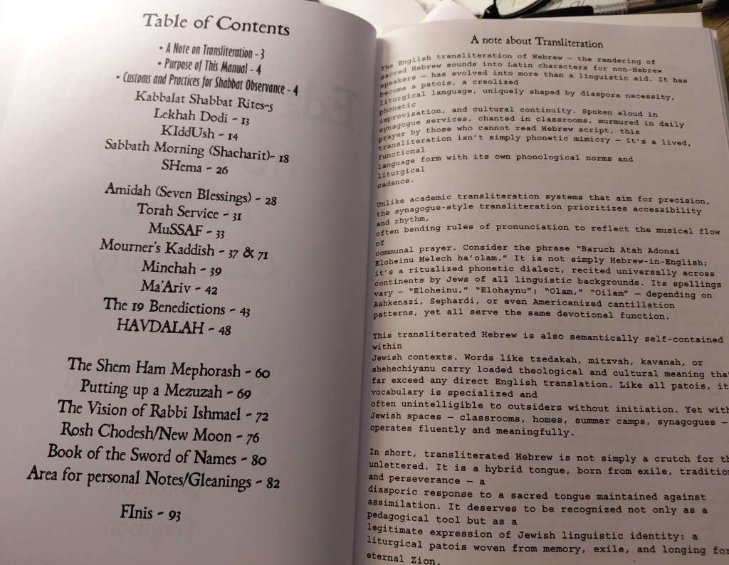
Inside, the book opens with a thoughtful table of contents and a carefully written note on transliteration. Ferguson’s explanation elevates transliteration beyond mere practicality, framing it as a diasporic dialect that fosters access, rhythm, and cultural continuity in communal prayer. The selection of prayers—from Shabbat services to ritual instructions like putting up a mezuzah—demonstrates a balance of the familiar with unique meditations such as The Vision of Rabbi Ishmael and The Book of the Sword of Names.
The layout is approachable, blending Hebrew, transliteration, and English in a way that empowers diverse readers to engage with the text, whether fluent, learning, or returning to tradition.

Title: Stop Road Rage: Public Safety Poster
Medium: Digital Poster
Style: Bold, Informative, Attention-Grabbing
Description:
This bold, high-visibility poster delivers a clear message: Help Us Stop Road Rage. With large, urgent typography and striking repetition, the design reinforces key safety tips to reduce aggressive driving.
Notable statistics highlight the problem:
- 46% of Colorado drivers report being road rage victims.
- 62% of car accidents stem from road rage.
- Nearly 30,000 aggressive drivers were reported in 2023.
The poster’s safety tips—Stay Calm, Avoid Engaging, Give Space, Use Turn Signals, Report Aggressive Driving—are short, actionable, and repeated for emphasis. The final call to action, “Safety Begins With You. Say NO to Road Rage!” leaves a memorable impression.
A direct, effective piece ideal for public spaces and community outreach.

Title: Krampus: The Winter Watcher
Medium: Traditional Mixed Media (Ink and Paint)
Style: Expressionist Cartoon Horror
Description:
This vivid, high-energy illustration of Krampus bursts with bold color choices and aggressive, exaggerated expressionism. Rendered in a graphic, almost punk-inspired cartoon style, the monstrous figure dominates the composition with hypnotic, spiraled red-and-yellow eyes, jagged white eyebrows, and a mouth twisted in a ferocious, toothy snarl.
The Krampus’ skin is a piercing frost-blue, which violently contrasts against the vibrant green mane that engulfs the figure like a chaotic aura. Sharp, ridged horns wrapped in metallic gold bands pierce out from his forehead, adding a demonic grandeur to the visage. The background pops with solid red corners adorned with simplistic snowflake motifs, blending holiday symbolism with a sense of creeping dread. Thin black and white vertical lines frame the sides, heightening the sense of visual tension.
The overall aesthetic channels an underground comic vibe, fusing holiday folklore with a rebellious, almost grotesque artistic flair. This version of Krampus feels both menacing and unhinged—an unapologetic celebration of the darker side of winter mythology

Title: Vector Versatility: A Study in Stylized Icons
Medium: Digital Vector Illustration
Style: Modern Flat Design with Pop Art Influences
Description:
This dynamic set of vector illustrations showcases the designer’s versatility in both subject matter and visual language. Each design is distinct yet unified by bold color choices, strong outlines, and a minimalist, high-impact aesthetic.

